
Contents
They say we’re living in the best era in history.
The digital era. The era in which everything is more convenient, faster, smarter, more connected and, of course, more wonderful.
They say it with that cell-carrier-commercial smile, with the sparkle in the eye of a consultant who just slapped the word smart on a toaster and now believes he has contributed to human progress.
I, on the other hand, increasingly suspect that a big chunk of what they call digital transformation boils down to taking things that worked reasonably well, complicating them to the point of absurdity, and then blaming the user for failing to adapt.
Because that’s the great trap of today’s tech talk: if you don’t understand the device, the problem is you.
If you can’t work the menu, if you can’t tell a spin-cycle icon from an eco-plus turbo steam rinse one, if the TV throws a message at you about cookies, terms of use, and firmware updates when all you wanted was to watch the evening news, then apparently you’re the clumsy one.
Never the product. Never the manufacturer. Never the genius who decided that running a load of laundry should involve navigating an interface that looks like it was conceived by someone who deeply hates human beings.
I work in tech. I’m not exactly illiterate when it comes to technology. A command line doesn’t scare me, an error message doesn’t send me into a panic, and I’ve lived with enough absurd systems to develop a blend of clinical patience and industrial-grade cynicism.
And even so, it’s very clear to me by now that the so-called digital divide is no longer just about having internet access or not. That was the old version, the simple one, the one that fit in a government slogan.
Today’s digital divide is about something much juicier and much nastier: more and more everyday objects, services, and errands are designed as if the entire population had perfect vision, fine motor skills, infinite patience, strong reading comprehension, time to spare, and a burning desire to earn a master’s degree in order to park the car or heat up dinner.
How parking the car became a mystical experience
The first time I used one of those modern parking meters that are supposedly here to make your life easier, I had a small mystical experience. And by mystical I mean I came very close to leaving my body.
You’d think a parking meter is a machine with a fairly humble job: you show up, drop in a coin, press a button, it spits out a ticket, and you leave. Well, no. That would be too intuitive, too human, not nearly innovative enough. The meter I ran into seemed to have been designed by a committee made up of a bureaucrat, a video game designer, and a sworn enemy of the concept of simplicity.
First you had to pick one of four buttons, with no clarity whatsoever about which one matched what I actually wanted to do. Then came the coin part. Then a confirmation. Then waiting. Then trusting that the ticket would come out. And if it didn’t, you could go ahead and start doubting your own existence, because the machine showed no interest in explaining whether it had failed, whether you were waiting wrong, or whether you had simply offended the patron saint of metered parking.
I wrestle with computer systems for a living, and it still took me longer than I’d like to admit to sort that out.
Now picture an older person, someone with low vision, someone who has never had much contact with modern interfaces, or simply someone who doesn’t expect parking the car to turn into an escape room sponsored by city hall.
Complexity doesn’t disappear just because the manufacturer says the experience is intuitive. Complexity only changes places. It leaves the inner workings of the gadget and lands on the user like a ton of bricks.
The designer is pleased because he cut down on buttons, slimmed down the casing, and added an adorable little screen. The marketing department applauds because now the product looks premium.
And then you show up, wanting nothing more than to carry out a trivial task, and find yourself negotiating with a nested menu that reads like Kafka wrote it on a bad afternoon.
What the modern user needs: fairy fingers, hawk eyes, and the patience of a saint
Something similar happens with touch technology, except there’s also a very entertaining physical component: it assumes we all have fairy fingers and a surgical precision that would put a Japanese neurosurgeon to shame.
I have big fingers. That sounds like a silly detail until you’re using phones, tablets, touchscreens, or on-screen keyboards designed as if the human fingertip measured half a millimeter and had no flesh around it.
It gets pretty irritating to type on certain devices when you press one letter and get the three next to it, or when you try to close a window and end up accidentally accepting the terms of service of a company in Singapore.
But at least I more or less know what’s going on. I already take it for granted that the device is hostile and probably setting traps for me.
Now picture the same thing for a person with motor impairments. Or someone with a tremor. Or an elderly person whose hands aren’t as precise as they used to be. Or, simpler still, anyone who doesn’t have the patience to repeat an action five times because the designer decided the useful button should be the size of a breadcrumb.
Then come the talks about inclusion, accessibility, and user-centered design, all delivered very solemnly at conferences where nobody seems to have ever tried using a touchscreen with arthritis, with presbyopia, or with the ordinary fingers of a small-town guy who has handled real tools in his life.
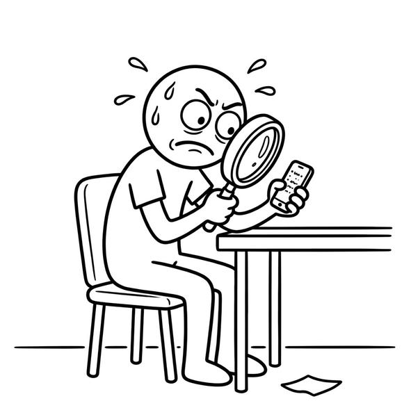
Presbyopia, by the way, is another one of those evolutionary jokes that force you to rethink your relationship with technology. There comes a point in life when tiny messages on tiny screens stop being an annoyance and become a declaration of war.
And that’s when you discover that a good share of the digital universe was conceived by eagle-eyed thirty-year-olds with a touching faith that their condition will last forever.
Gray text on a light gray background, microscopic typefaces, contrast levels that seem chosen to punish anyone who still has a shred of visual dignity. All very clean, very minimalist, very elegant. Very nice for Instagram. Not much use for reading anything without pulling out your glasses, finding better light, craning your neck, and wondering why on earth a dishwasher notification needs to be less legible than a box of ibuprofen.
The washing machine, or the art of deciphering Scandinavian hieroglyphics to do a load of laundry
And then there are home appliances.
Ah, home appliances. That territory where the industry has decided every household chore must become a premium user experience, which is a very polite way of saying that doing laundry now requires interpreting hieroglyphics.
It used to be a dial, a handful of programs labeled in readable text, and maybe two buttons. You could be an aerospace engineer or a sheep herder; the washing machine didn’t discriminate. It washed. End of story.
Now, though, some washing machines greet you with a screen, menus, submenus, icon combinations, and pseudoscientific terminology that sounds like it was drafted by a Scandinavian spin-cycle cult.
Doing a load of laundry has become a high-risk activity. Not so much for fear of mixing colors, which is a classic, but because you don’t even know whether you’re in the right mode.
You see a leaf, a cloud, a T-shirt, a droplet, a symbol that could be steam or a tribute to cave painting, and you have to work out which one stands for something as exotic as “normal wash.”
All this for an appliance whose historic mission was to add water, soap, and spinning. But of course, if they give you three buttons and plain text, how do they justify the price? How do they sell you the innovation? How do they convince you that you need Wi-Fi connectivity to wash your socks?
The religion of digital has produced this ludicrous situation in which any simple device that doesn’t complicate your life comes across as outdated, even if it works better.
We’ve reached a point where sober, clear, legible design is seen as behind the times, while a confusing interface full of layers, animations, and unnecessary options is sold as advanced.
It’s extraordinary. It’s as if the car industry had convinced us that the harder it is to open the glove box, the more modern the car (like in a Tesla?).
How I became a factory-farmed chicken with a smartphone
But the digital divide isn’t only about gadgets. It’s also about mental habits.
And here I have to admit something I’m not thrilled about: ever since I’ve had fewer paper books around, I’ve noticed I’m lazier about reading. I really do notice it.
I used to sink into a book and last longer in one sitting, with more attention and less temptation to jump from one thing to another. Now I often catch myself preferring videos. Videos that, to top it off, I play at 2x because I don’t want to waste time.
In other words: I’ve turned cultural consumption into a kind of accelerated industrial intake, as if knowledge were feed and I were a factory-farmed chicken.
I don’t think this is making me any smarter. Quite the opposite: I think it’s training me for impatience, fragmentation, and constant mental pecking.
And if it’s happening to me, and I’m at least aware the habit is decaying, I’d rather not think about what’s happening at the scale of a whole society when half of humanity has decided that any piece of content longer than three minutes demands an intolerable moral effort.
We have access to more information than ever, sure. But that doesn’t mean we know more. Or think better. Or can tell what’s valuable from what’s garbage.
Having an infinite library in your pocket doesn’t make anyone well-read, any more than sleeping on top of a toolbox makes you a mechanic.
The digital native: quick with the filter, lost with the search engine
In fact, one of the great intellectual scams of the last twenty years has been the so-called “digital native”.
That educational fantasy according to which children and teenagers, having been born surrounded by screens, understand technology almost organically, the way ducklings understand water.
I’ve always thought this was nonsense, and on top of that the data contradicts it. And everyday experience grinds it to dust.
Because in my dealings with kids (friends’ children, honorary nieces and nephews, assorted teenagers orbiting my age like cruel reminders that time is passing), what I see is some pretty serious functional ignorance the moment you step outside basic consumption.
They handle a phone fast, sure. They can open TikTok before you’ve found your glasses. They can send mile-long voice messages, chain videos together, apply ridiculous filters, and live inside an ecosystem of consumer apps with impressive ease.
But sit them down in front of a computer and the magic wears off pretty quickly.
They don’t know how to organize files. They don’t understand folders. They can’t really tell a browser from an operating system from a web app from a local document. As for browsing the internet, in the broad and somewhat dignified sense of the phrase, they haven’t mastered that either: they search badly, fact-check worse, read very little, and put enormous trust in the first thing that pops up in front of them as long as it’s presented with enough confidence and a couple of bright colors.
And it’s not their fault. Or not only theirs.
Nobody taught them. Everyone assumed they already knew. That being young, they would absorb digital skills by osmosis, as if technical knowledge were ambient humidity.
And then, of course, reality shows up, and it’s a lot less poetic: using WhatsApp doesn’t teach you how to write a document, installing an app doesn’t teach you how a system works, and watching videos all day doesn’t give you the judgment to sort good information from bad.
What you end up with are superbly trained digital consumers and fairly limited users the moment you take them out of the entertainment-app theme park.
Exclusion as a service: the progress the same people always pay for
At the other end are older people, a group I’m heading toward at cruising speed, which is always a cheerful thought.
That’s where the digital divide stops being a theoretical debate and becomes a pretty cruel form of exclusion. Because when a device is hard to see, hard to touch, hard to understand, and hard to fix when you make a mistake, it isn’t being modern: it’s being hostile.
And that hostility hits hardest the people with the least room to fight back.
We’re talking about people with aging eyes, with a tremor, with less working memory, with less prior experience of menus, pop-ups, confirmations, and absurd flows. People who aren’t stupid, or slow, or incapable. People who are simply having an environment imposed on them that was designed by and for those who start from a very specific set of skills and are then surprised that not everyone fits.
The most perverse part is that this exclusion tends to be presented as inevitable progress.
Branches close, buttons get replaced with screens, human contacts get eliminated, basic paperwork goes digital, and then it all gets dressed up in words like efficiency, modernization, and good environmental intentions. Very nice. Very corporate. Very panel-discussion-with-coffee-and-smiles.
But the truth is that behind all that efficiency there’s usually a brutal cost shift: what the company saves on staff, support, clear interfaces, or in-person service, the user pays for in time, frustration, dependence, and a healthy dose of everyday humiliation.
And this is where the real digital divide shows up. Not between those who have fiber and those who don’t, although that still matters.
But between those who can adapt to this delirium of hostile interfaces, cryptic menus, and digital obligations, and those who can’t do it without help, without wearing themselves out, or without being left behind.
Between those who have the money for better devices, better glasses, a better connection, time to learn, and someone nearby to sort out the messes, and those who don’t.
Between those who have built up a professional tolerance for technological absurdity and those who still naively expect objects to be good for something more than showing off a screen.
The digital divide is also economic, of course. It always has been. It’s just better disguised now.
Because almost everyone “has access” to something: a phone, a mediocre connection, a TV with internet, a tablet forgotten in a drawer. And so the problem looks solved. As if providing access were enough. As if owning a smartphone were the same as having digital literacy. As if connecting were the same as understanding. As if having a banking app were the same as being able to use it without fear of making a mistake and losing money.
We love measuring the easy stuff, because that way we can declare ourselves satisfied: “93% digital penetration”, “growth in internet use,” “the democratization of technology.”
Fantastic. Now try booking an appointment, filling out a form, or making sense of an interface without help, and then get back to me.
Digital empowerment (read: now you do the paperwork yourself)
The way all of this gets sold is deeply cynical. They tell you digital empowers the user, when what it often does is hand the user more work.
A person used to help you; now you do the paperwork yourself. There used to be clear buttons; now you navigate four menus. A machine used to have one function; now it has twenty and you don’t need nineteen of them. Usability problems used to be the exception; now they’re a structural part of the product.
And, of course, all of this is sold as progress. Because if you put a screen on a thing, the thing already looks better. Never mind that it got worse. Never mind that my grandmother used to be able to work it and now needs a grandchild on permanent tech-support duty.
What matters is that the contraption can brag about connectivity, machine learning, or push notifications to let you know your socks have finished spinning.
A large share of contemporary digital design seems to be made by people who have never once watched an ordinary human being use anything.
And by ordinary human being I mean someone who doesn’t make a living from technology, doesn’t enjoy poking around in menus, doesn’t read manuals for sport, and doesn’t consider it reasonable to spend an afternoon figuring out how to change the input source on a television.
If you forced manufacturers, designers, and digital transformation gurus to spend a week watching older people, people with low vision, people with clumsy hands, users worn out after work, kids unable to find a file they just downloaded, and tech professionals cursing a blue streak at a city parking meter, they might start to suspect that the problem isn’t the population.
The technology worth having: the kind you don’t notice
Good technology is the kind that disappears. The kind that lets you get things done without making itself the main event. The kind that doesn’t demand a ceremony. The kind that doesn’t make you think about the device for more than a few seconds. The kind that doesn’t punish age, clumsiness, fatigue, lack of habit, or simply the very reasonable wish for things to be clear.
Everything else is noise dressed up in prestige. It’s needless complexity sold as added value. It’s industrial arrogance.
I’m not against digital. That would be absurd, not to mention inconsistent coming from someone who works in this field.
I’m against stupidity with a pretty interface. I’m against the systematic replacement of what’s understandable with what merely looks good. I’m against designing for the photo instead of for use.
And I’m very much against that repugnant condescension shown to anyone who can’t adapt to badly made products, as if the fault lay with the user and not with the idiot who turned a simple task into a pilgrimage through menus.
The digital divide is not a metaphor. It’s a daily toll.
It’s paid by the elderly man who can’t figure out the TV, the kid who lives in apps but can’t use a computer, the person with thick fingers who keeps missing on a miserable touchscreen, whoever is starting to see worse and discovers the future is set in 8-point type, and it’s paid by me too, someone who works in computing and still sometimes looks at certain devices with the same mix of rage, contempt, and bewilderment you’d reserve for a self-help shelf at an airport.
And meanwhile, there they are, still selling us the same bill of goods.
That digital is best. That everything is going to be easier. That the user is at the center.
Sure. At the center of the bullseye.
Quick glossary
Here are the concepts that show up in the text and deserve a couple of lines of context, in case anyone arrived without taking the prerequisite master’s degree.
- Accessibility: the quality of a product that anyone can use, including people with low vision, a tremor, or little ease with screens. Mentioned a lot at conferences and rarely tested with real users.
- Digital literacy: the ability to understand and use technology with good judgment, which is not the same as owning a phone. It includes searching, fact-checking, and knowing what you’re agreeing to when you press a button.
- Digital divide: the gap between those who have access and real competence to use technology and those who don’t, whether because of resources, skills, or hostile design.
- Firmware: permanent software embedded in a device’s hardware. The thing your TV “updates” when you least expect it, making it take three minutes to turn on.
- Fine motor skills: the ability to make precise movements with the hands and fingers. What touchscreens assume we all have in abundance and at any age.
- Digital native: a term coined in 2001 to describe those who grew up surrounded by technology and supposedly master it intuitively. Works great in consulting-firm slide decks; somewhat less so in practice.
- Presbyopia: the gradual loss of the ability to focus on nearby objects, common from age 40 onward. Also known as “suddenly the text on my phone is too small and it’s not the manufacturer’s fault.”
- UX (user experience): the discipline that studies how people interact with digital products. In theory oriented toward the user; in practice, sometimes oriented toward the designer’s portfolio.
Sources and references
For those who’d rather have the numbers than my war stories with the parking meter.
- Brecha digital: el 67% de los mayores de 60 años afectados en España – Gestión y Dependencia
- El edadismo tecnológico alcanza a más de 3,5 millones de personas – UGT
- La falacia del “nativo digital” – ICDL Global
- Influencia del uso de WhatsApp en la competencia digital en el área de comunicación – Casillas Martín et al., University of Salamanca
- SmartTV: una barrera de uso para las personas mayores – Málaga Original
- Los peligros de la desinformación para los más jóvenes – Ciudades Amigas de la Infancia
- ¿Y si no pudiera ver la pantalla? Tecnología e inclusión de personas con discapacidad visual – Telos, Fundación Telefónica
- Capital humano y habilidades digitales en el Índice DESI – European Commission
- Panorámica general de la brecha digital en España – UGT (PDF)
- Rompiendo barreras: la brecha digital en la tercera edad – Casa de la Ciencia, CSIC
- Tecnología y recursos adaptados para personas con discapacidad visual – ONCE
- El uso intensivo de la tecnología, incluso con fines pedagógicos, empeora los resultados – Magisnet
Other languages: Español